Introduction
Modals are a frequent UI element in our applications, in fact, I would say all the applications I have coded have some sort of modals on them.
 And when it comes to how to code them, we usually tend to use a UI element (Bootstrap, Material UI, etc.) or develop our own implementation in plain React, but did you know that there’s a standard HTML element called
 dialog to display modals?
Why use the standard dialog element
Using the standard dialog element gives us several advantages over doing our own implementation, advantages like:
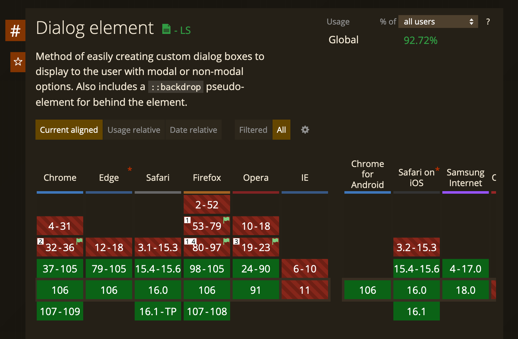
- It’s widely available (92% of browsers support it at the moment)
-
accessibility out of the box This element already implements the most basic fundamental of accessibility for HTML dialogs
-
standard HTML element Which mean that this element is not going away anytime soon, thus making our application a bit more future-proof
-
less code Because we won’t need to use the
aria-*properties anymore, and also we don’t need custom logic to render the modal outside the root component by using aReact.createPortal
Using dialog in your application
Adding the dialog element to our component
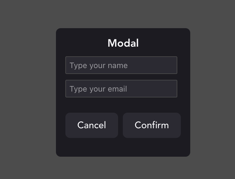
In our React component, we just need to add a dialog element with the content we want
<dialog>
  <form method="dialog">
    <section>
      <label htmlFor="name">Name: </label>
      <input name="name" placeholder="Type your name" />
    </section>
    <section>
      <label htmlFor="email">Email: </label>
      <input name="email" placeholder="Type your email" />
    </section>
    <menu>
      <button id="cancel">
        Cancel
      </button>
      <button type="submit">Submit</button>
    </menu>
  </form>
</dialog>
method="dialog"
Basically tells our application that when the form gets submitted, the modal needs to be close automatically
Accessing the dialog element on React
To do this, we will use the useRef hook
import React, { useRef } from "react";
function App() {
  const dialogRef = useRef();

  return (
      <dialog ref={dialogRef}>
          {/*...dialog content...*/}
      </dialog>
  )
}
Add a button to show the modal
Let’s add a button in our React component that once is called it will call the showModal function to open the modal
import React, { useRef } from "react";

function App() {
  const dialogRef = useRef();

  const showModal = () => {
    dialogRef.current.showModal();
  }

  return (
      <>
        <dialog ref={dialogRef}>
            {/*...dialog content...*/}
        </dialog>
        <button onClick={showModal}>Show Modal</button>
      </>
  )
Handling form submit
Now the only things left is to handle the onSubmit event, so let’s create a new function on the React Component to handle and get all the values from the form inside the modal
const onSubmit = (e) => {
  console.log({
    name: e.target.name.value,
    email: e.target.email.value
  })
}
Final code Let’s add a function to close the modal and that will be the final code
import React, { useRef } from "react";

function App() {
  const dialogRef = useRef();

  const openModal = () => {
    dialogRef.current.showModal();
  };

  const onCancel = () => {
    dialogRef.current.close();
  };

  const onSubmit = (e) => {
    console.log({
      name: e.target.name.value,
      email: e.target.email.value,
    });
  };

  return (
    <>
      <dialog ref={dialogRef}>
        <form method="dialog" onSubmit={onSubmit}>
          <section>
            <label htmlFor="name">Name: </label>
            <input name="name" placeholder="Type your name" />
          </section>
          <section>
            <label htmlFor="email">Email: </label>
            <input name="email" placeholder="Type your email" />
          </section>
          <menu>
            <button onClick={onCancel}>Cancel</button>
            <button type="submit">Confirm</button>
          </menu>
        </form>
      </dialog>

      <button onClick={openModal}>Show Modal</button>
    </>
  );
}

export default App;
Styling
To style our dialog we can use normal CSS properties, the only relevant and special thing is that if you want to change the background behind the modal you can use the pseudo-element ::backdrop, example:
dialog::backdrop {
  background: rgba(0, 0, 0, 0.7);
}
Polyfill
If you want to support browsers like Internet Explorer or old versions of Chrome, you will need to add this polyfill to your page: https://github.com/GoogleChrome/dialog-polyfill